

An empowering visual identity to support women at a sensitive stage of health

About the project
Mimosa is a digital health app created to support women during menopause. The platform combines medical expertise with AI to deliver targeted health insights and track progress.
Developed by TaraCares, the app provides personalized guidance, symptom tracking, and lifestyle suggestions. It helps women better understand their hormonal health and confidently manage their well-being.
Challenge
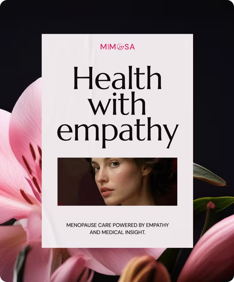
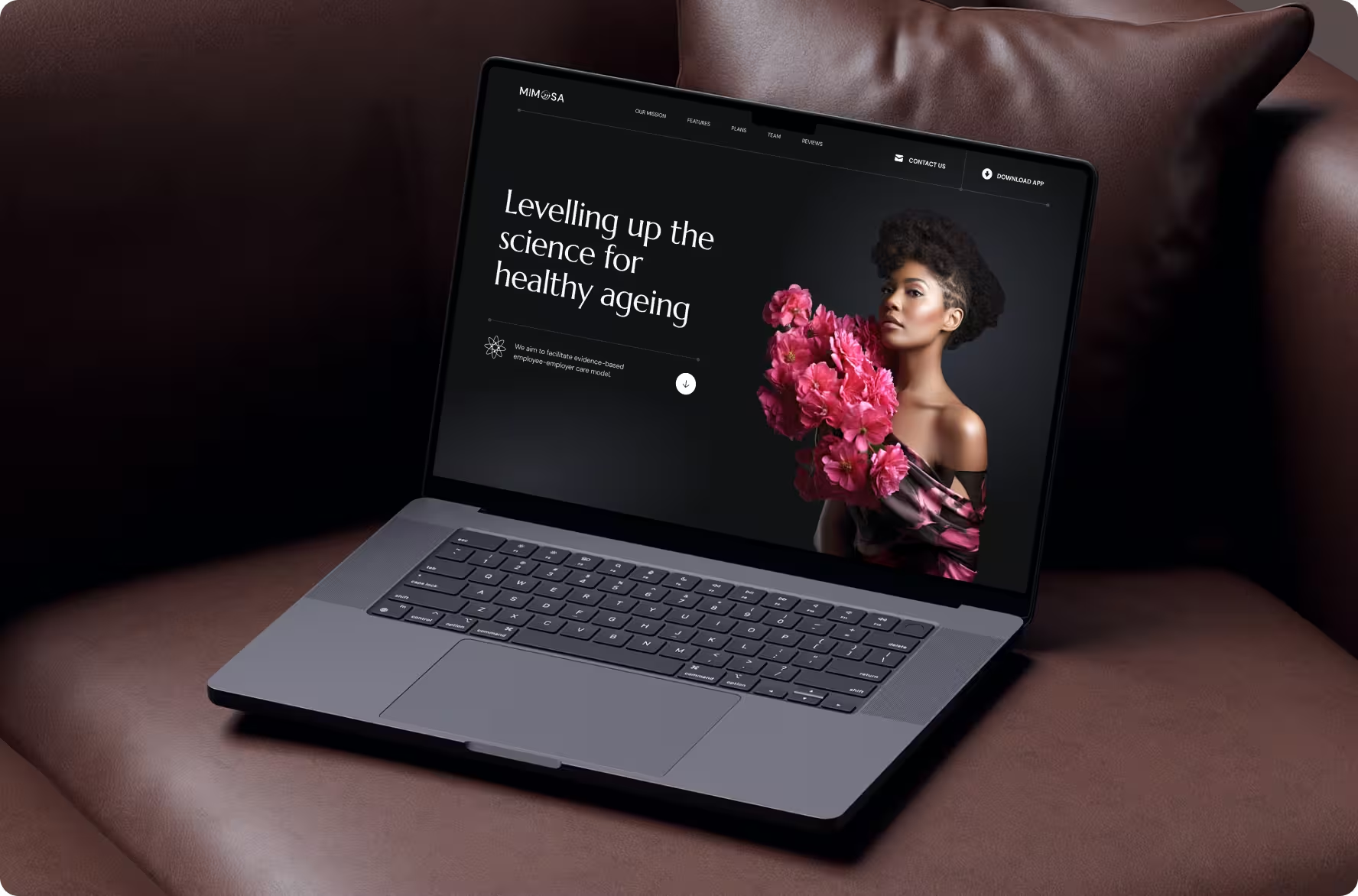
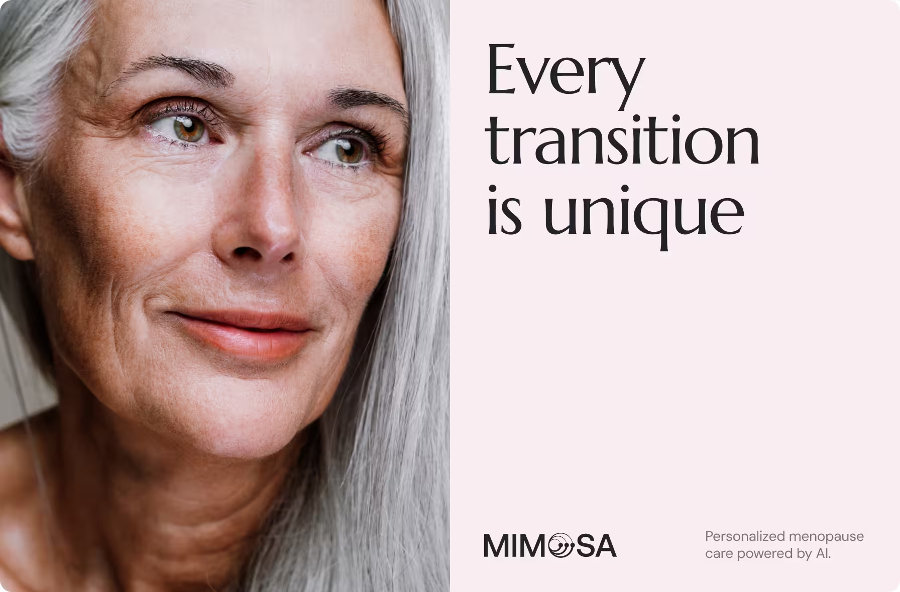
Mimosa sought to stand out among wellness apps as a scientifically credible, AI-powered menopause platform. The goal was to further develop a visual identity and website that convey medical reliability, emotional care, and clear value to individuals, clinicians, and businesses.
Our process
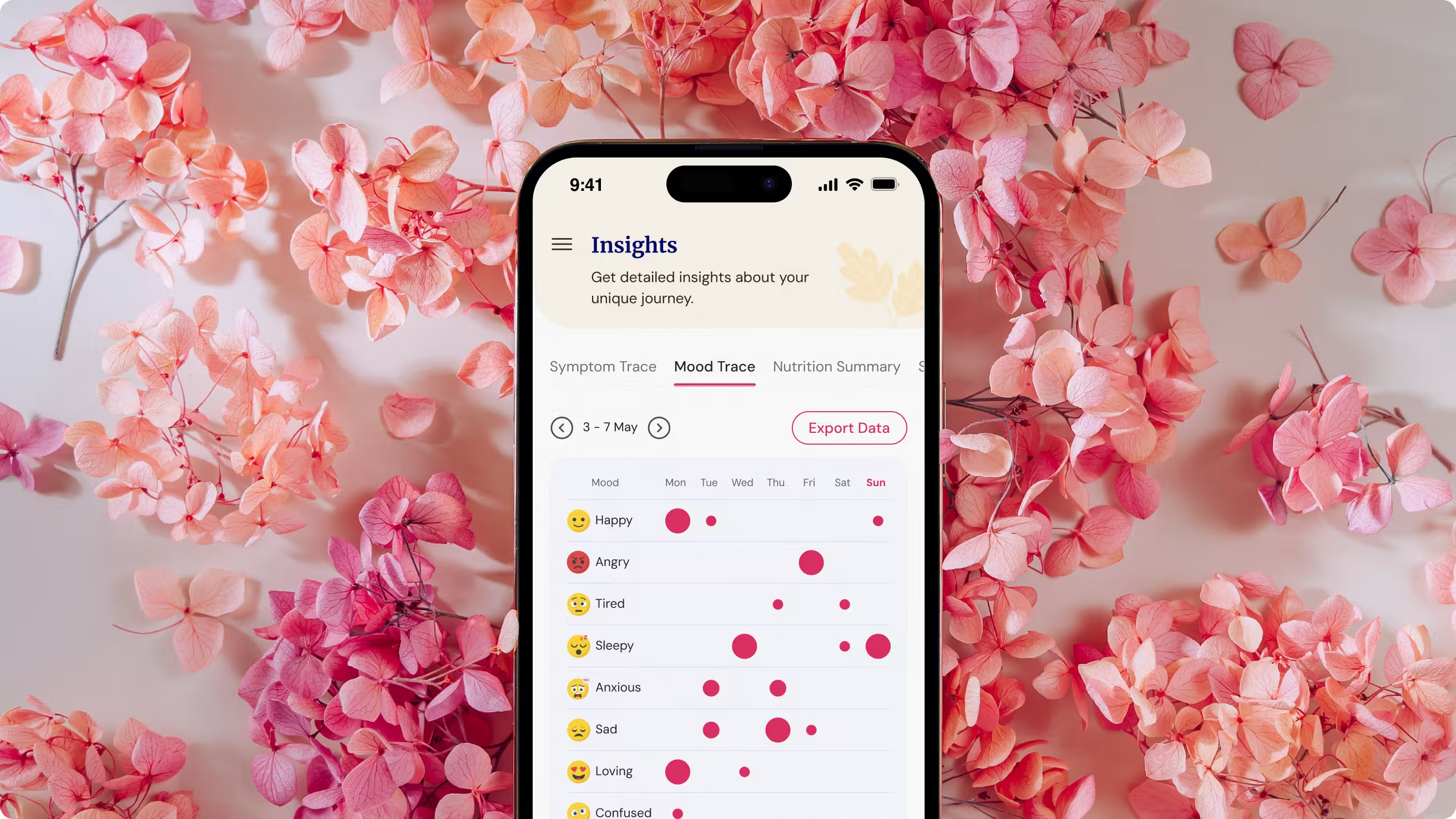
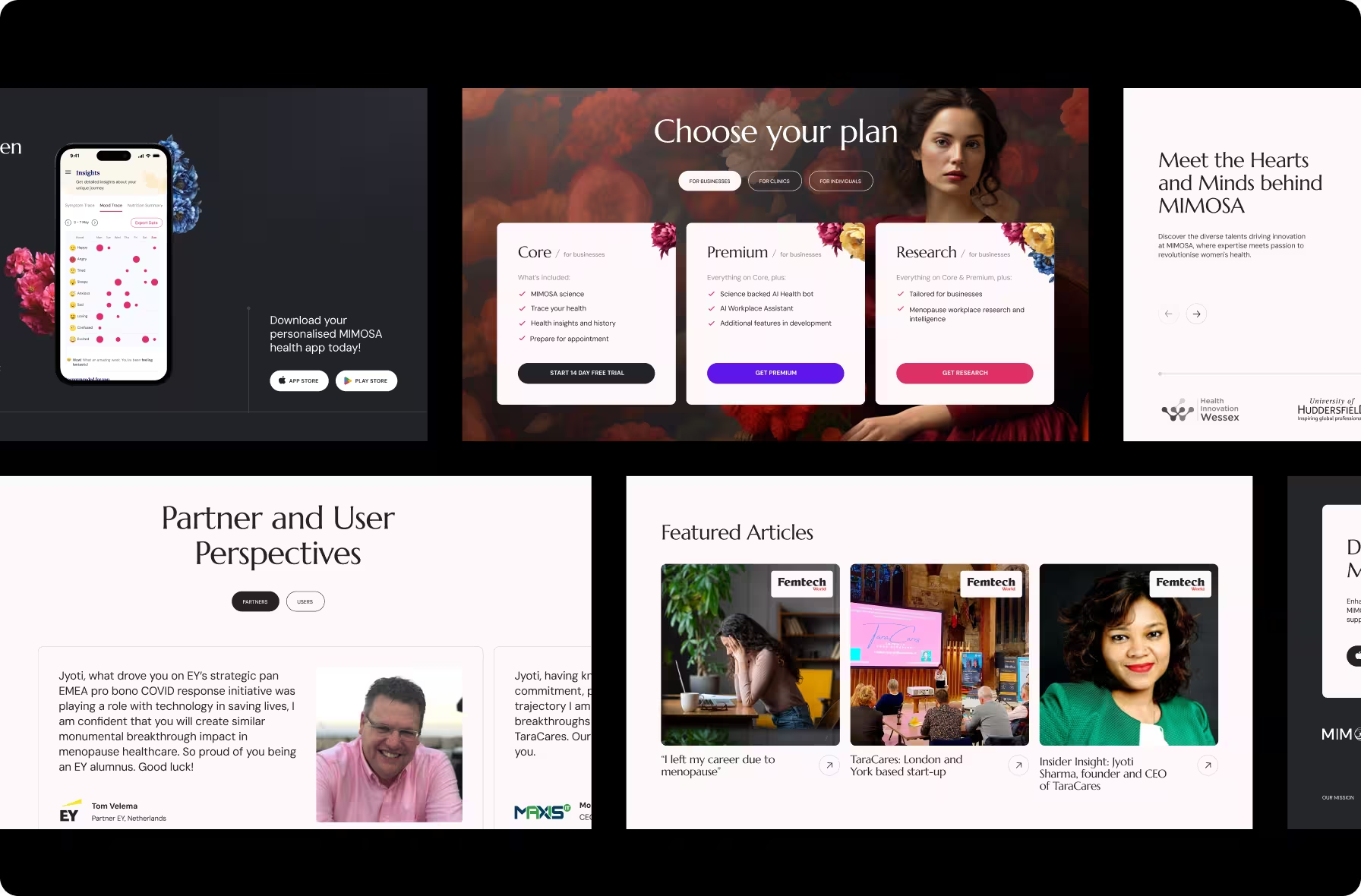
Throughout the project, we aligned visual execution with a clear positioning strategy to adapt Mimosa’s logo and landing page for multi-audience communication.
Results
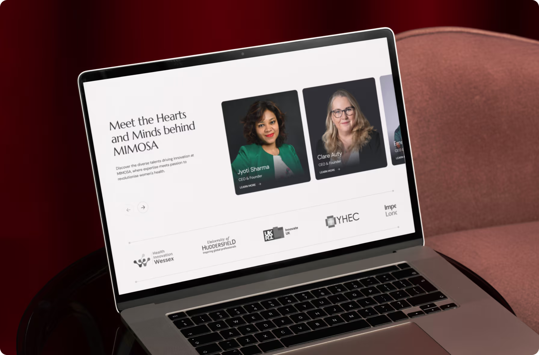
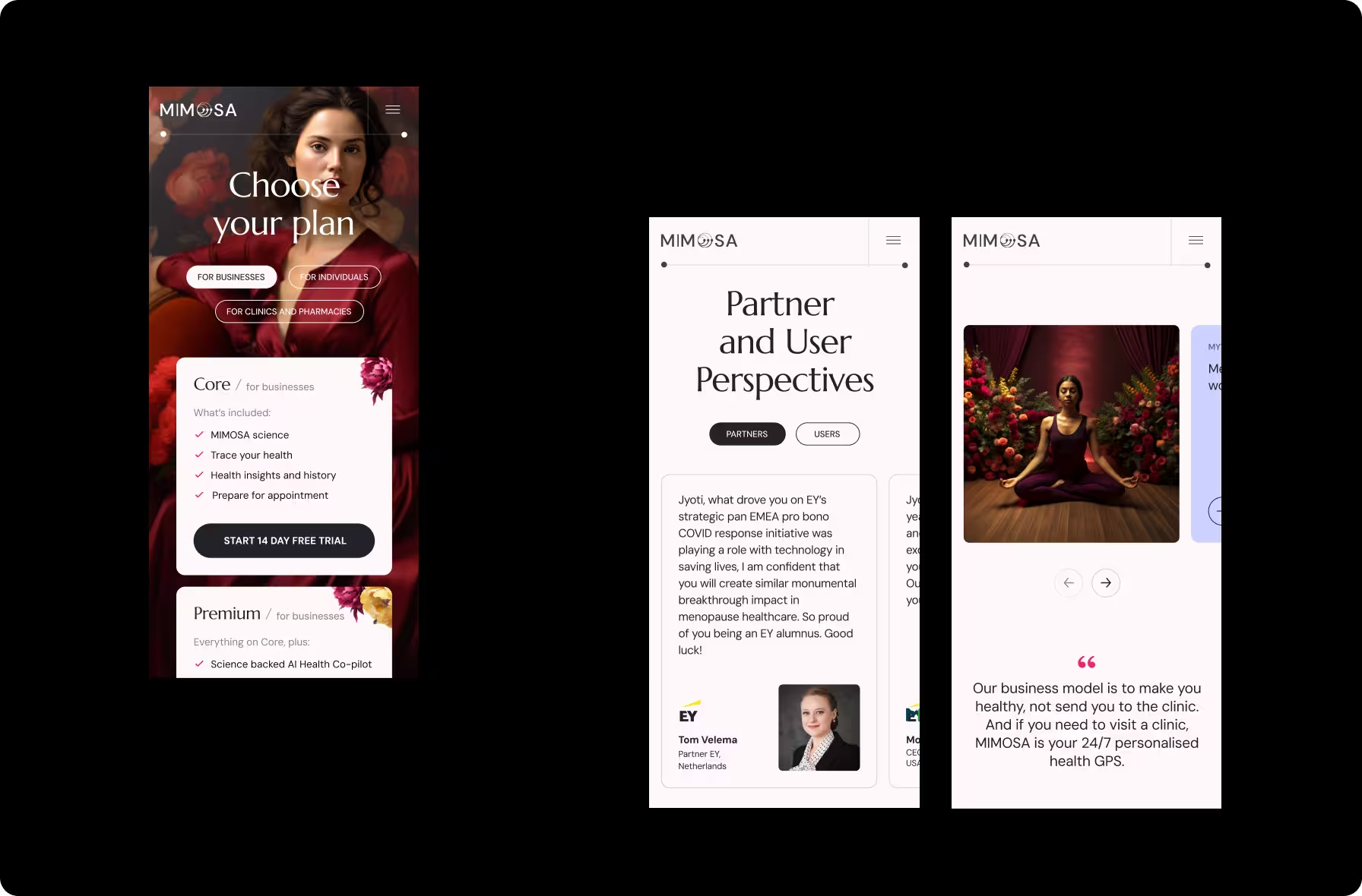
Mimosa’s new logo and landing page established a clear, credible foundation for market entry and positioned the product as a trusted companion for women navigating menopause. The refreshed visual identity and new landing page balance clinical credibility with emotional warmth, communicating medical reliability without losing personal relevance.
Our approach
We combined a strategy-first mindset with a focused design process to turn care and clinical credibility into a human-centered logo and website built for growth.